
Publix (Grocery eCommerce)
A mobile-first cart redesign that increased engagement and simplified the checkout flow.
Role: Senior Product Designer
Timeline: 2023
Platform: Mobile App
Collaborators: Product Managers, Engineers, UX Research Team
Publix aimed to improve their shopping app by refining cart visibility, simplifying navigation, and improving the overall checkout experience.
The existing cart experience created friction around discoverability, onboarding, and task completion during high-frequency grocery workflows.
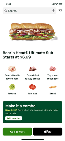
I collaborated with the Publix App team across research, ideation, testing, and mobile-first design exploration to improve cart accessibility and streamline the checkout experience.
The existing cart experience created friction across the app:
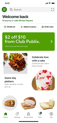
1. The cart was visually hard to spot
2. The navigation hierarchy confused users
3. The shopping bag icon led to ambiguity
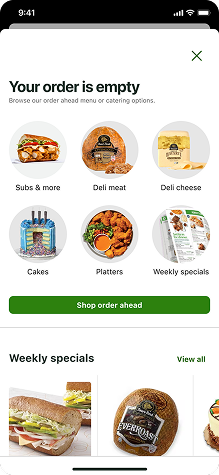
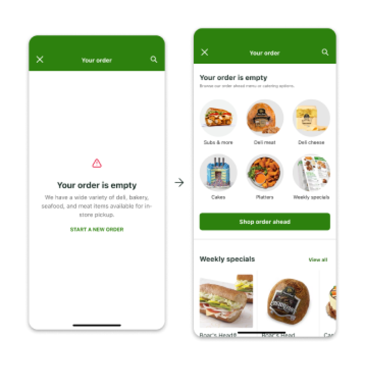
4. Empty cart state created a dead-end and zero exploration opportunity
These issues blocked essential user tasks.

To solve these issues, I followed a structured process:
Reviewed cart patterns from Amazon, Walmart, TikTok, and others to understand industry standards for:
• Cart placement
• Empty state design
• Purchase flows
• Iconography
Designed three distinct iterations exploring:
• Cart placement
• Empty state flows
• Cart with items
• Tutorial guidance
Conducted A/B/C testing with 54 participants to measure:
• Time on task
• Ability to locate PAY
• Understanding of new cart placement
• Naming clarity for cart vs bag
Users found the new PAY location immediately
• No increase in task time
• 85 percent recommended a tooltip tutorial
• 75 percent found “cart” to be grocery-associated, causing naming confusion
These insights shaped the final decisions.
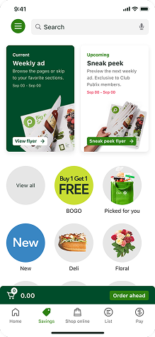
Moved the cart into the bottom navigation for maximum visibility and reach.
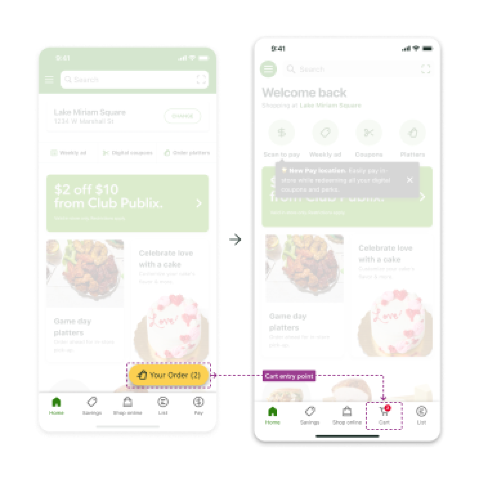
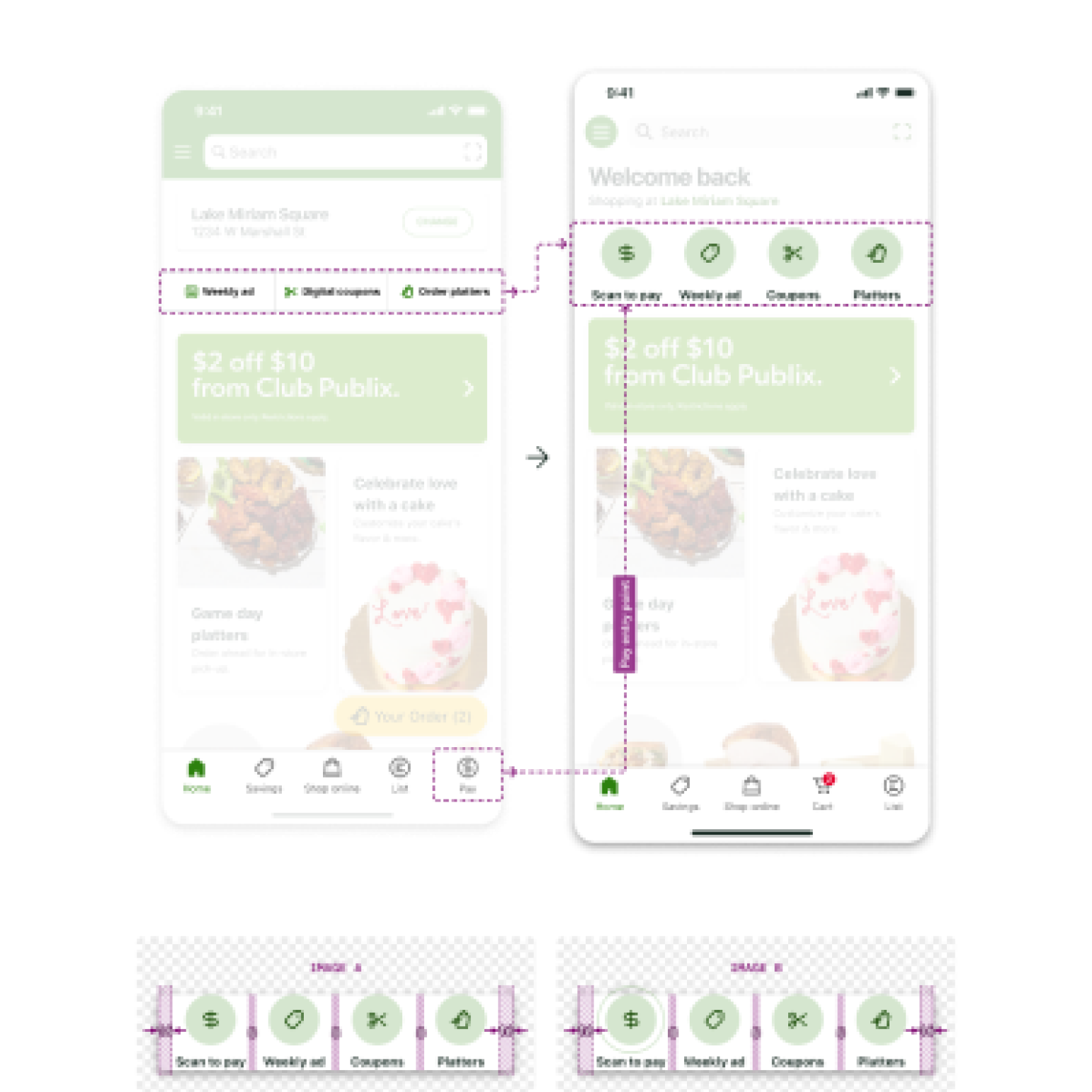
Added banners, PAY entry point, and historical analytics based on user purchases.
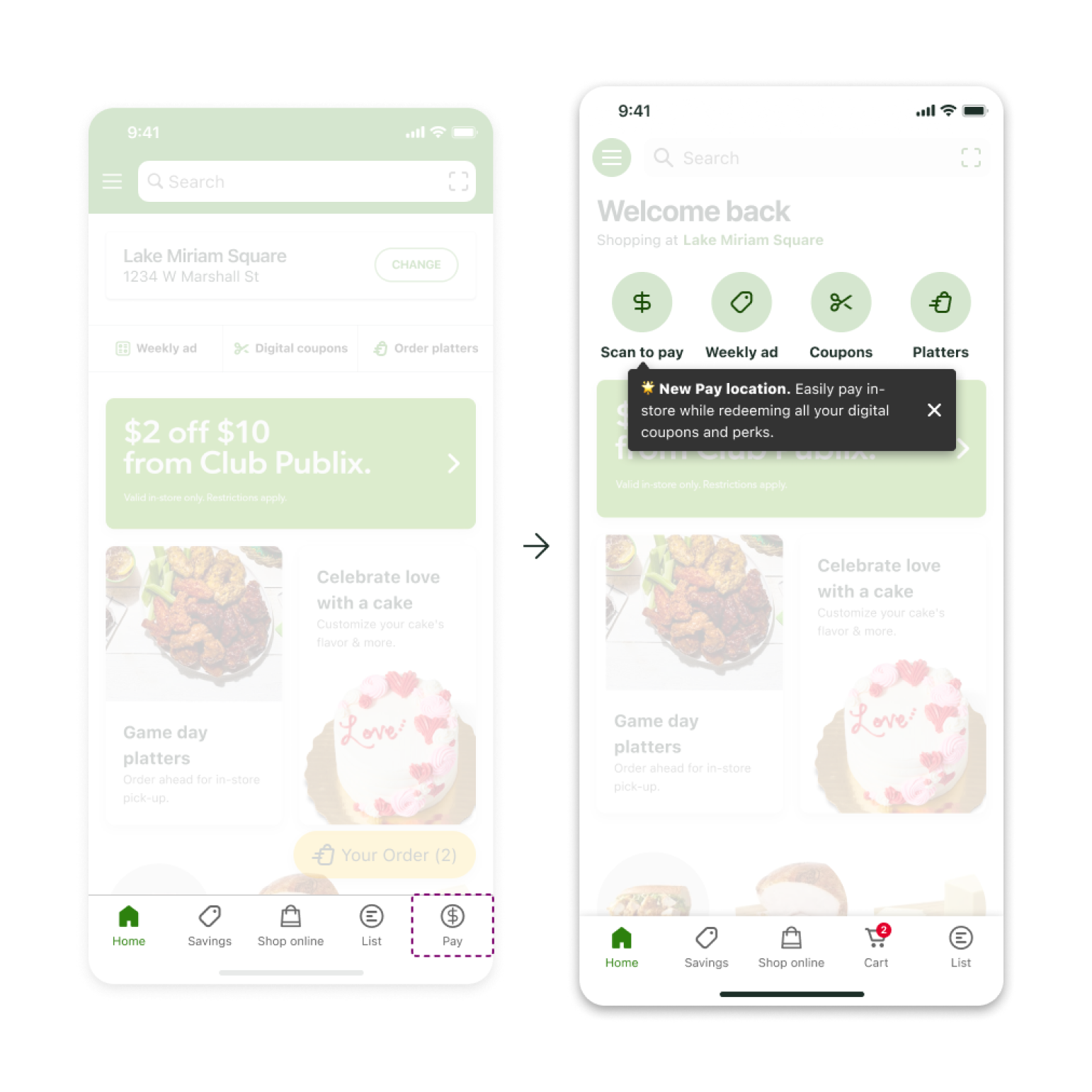
A brief in-app cue explains the new PAY location upon first use.
Added categories, weekly specials, and discovery paths to eliminate dead ends.
User testing with 54 participants helped validate the updated cart structure and visibility improvements, with most users preferring the simplified navigation and tooltip onboarding approach.
.png)
Gordan Food Service (B2B eCommerce)
Improving Gordon Food Service’s B2B PDP with clearer hierarchy, better product context, and streamlined ordering workflows.
Pearson (EdTech)
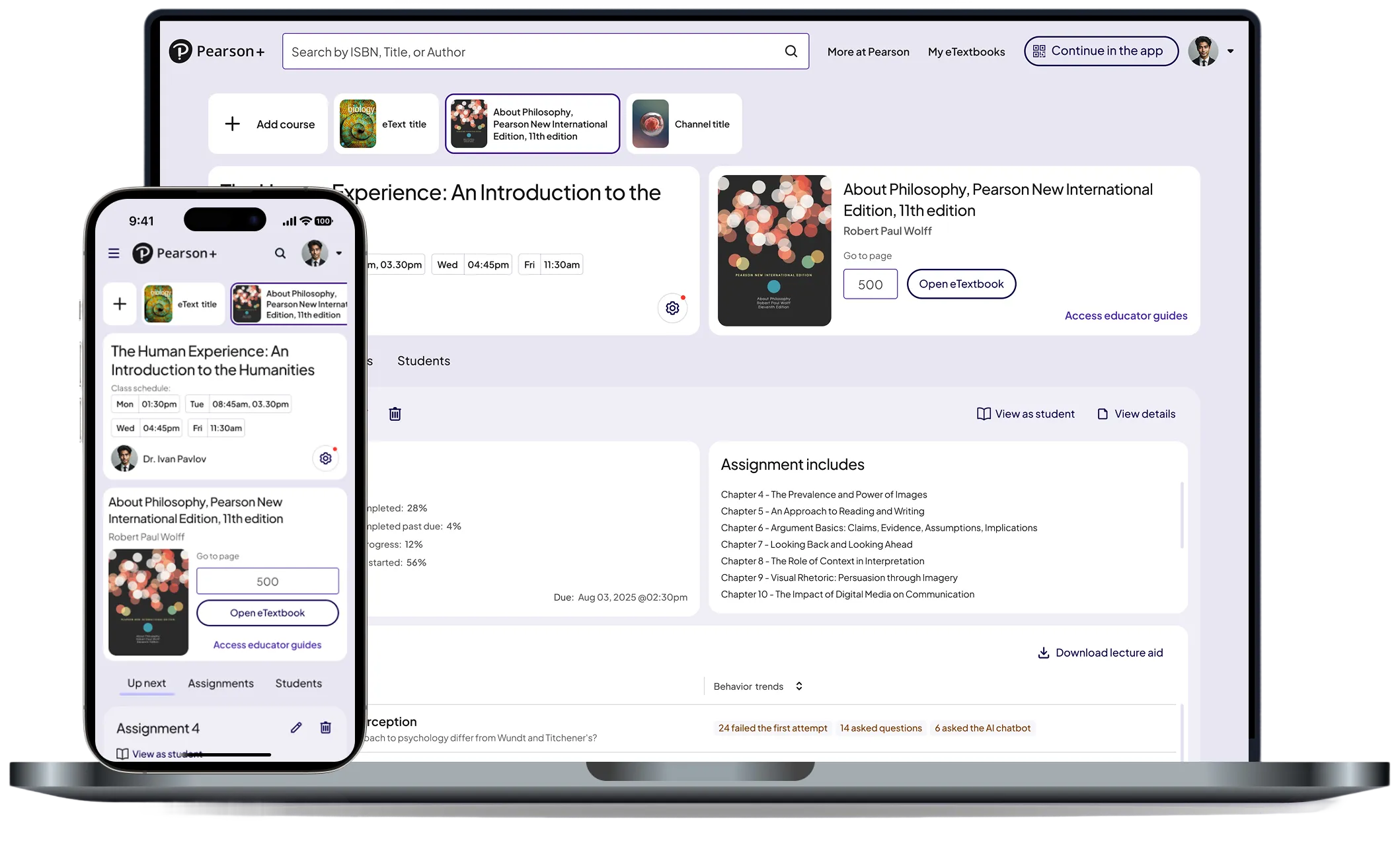
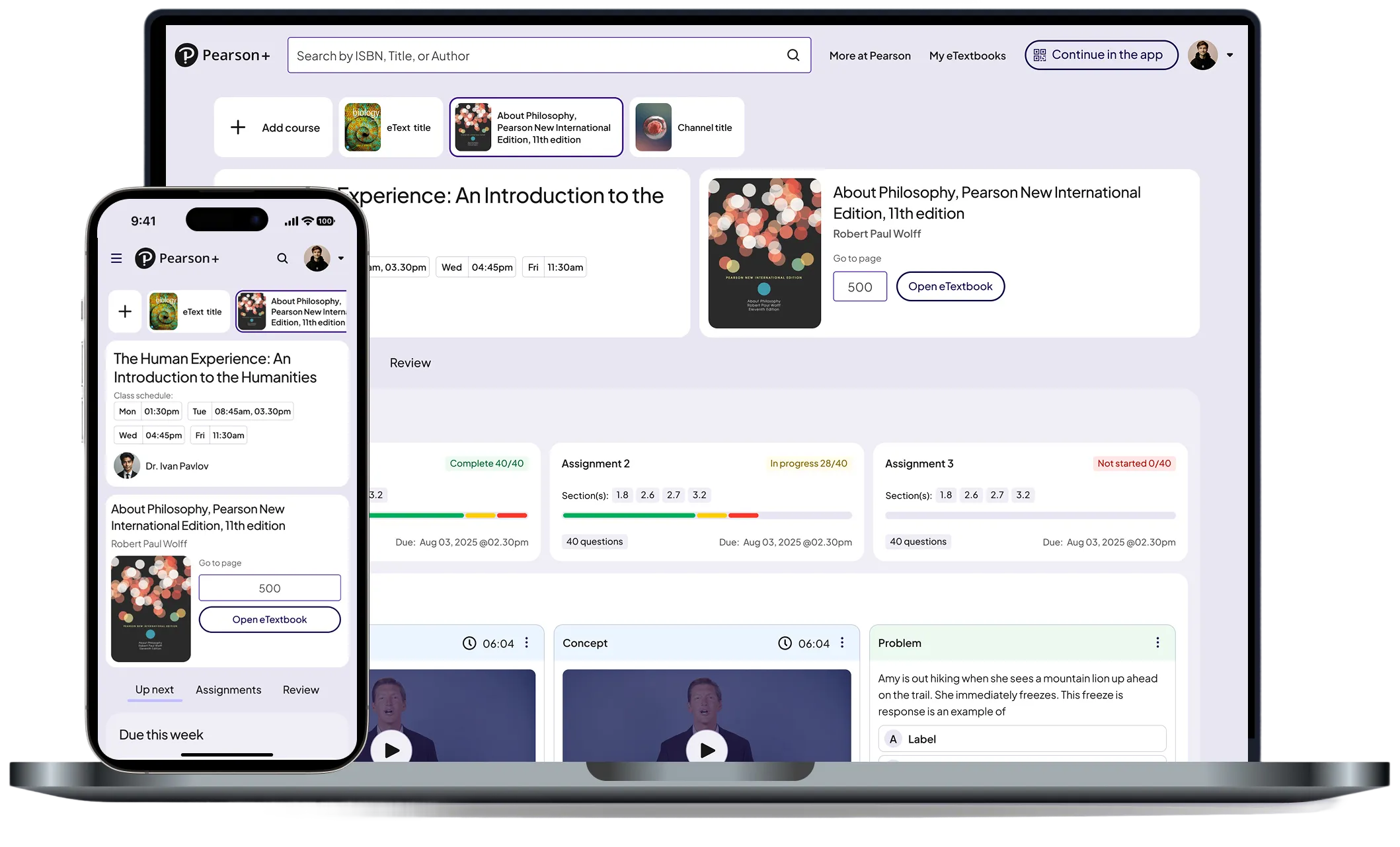
Turning raw performance data into clear, actionable insights across web and native.
© 2026 Dandrew Merriweather | Designed + Built by Dandrew