
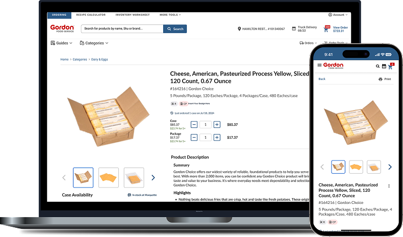
Gordan Food Service (B2B eCommerce)
Improving Gordon Food Service’s B2B PDP with clearer hierarchy, better product context, and streamlined ordering workflows.
Role: Senior Product Designer
Timeline: 2024
Platform: Responsive Web
Collaborators: Product Managers, Engineers, Ordering Team
The PDP redesign focused on improving product presentation, refining content hierarchy, and reducing friction in the shopping experience.
The original experience struggled with content density, weak hierarchy, and inconsistent buy section visibility, making product evaluation slower during ordering workflows.
I redesigned the PDP experience to improve scanability, strengthen product context, and simplify purchasing behaviors across desktop and mobile ordering flows.
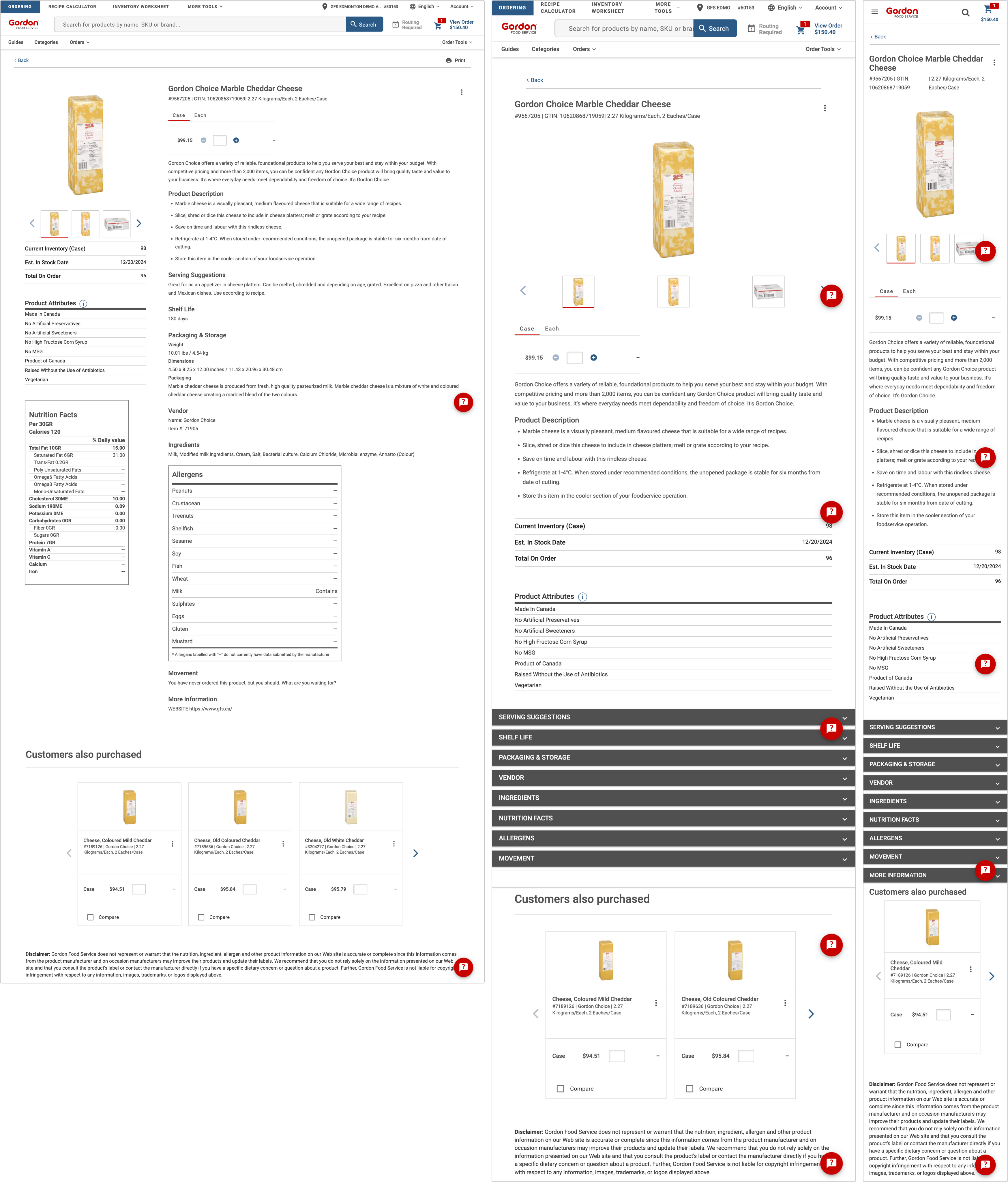
The legacy PDP created friction and confusion:
• Overloaded layout with poor hierarchy
• Unclear “Add to Cart” behavior
• Inconsistent product information
• Low engagement and slower conversions
These issues made evaluation difficult and reduced buyer confidence.
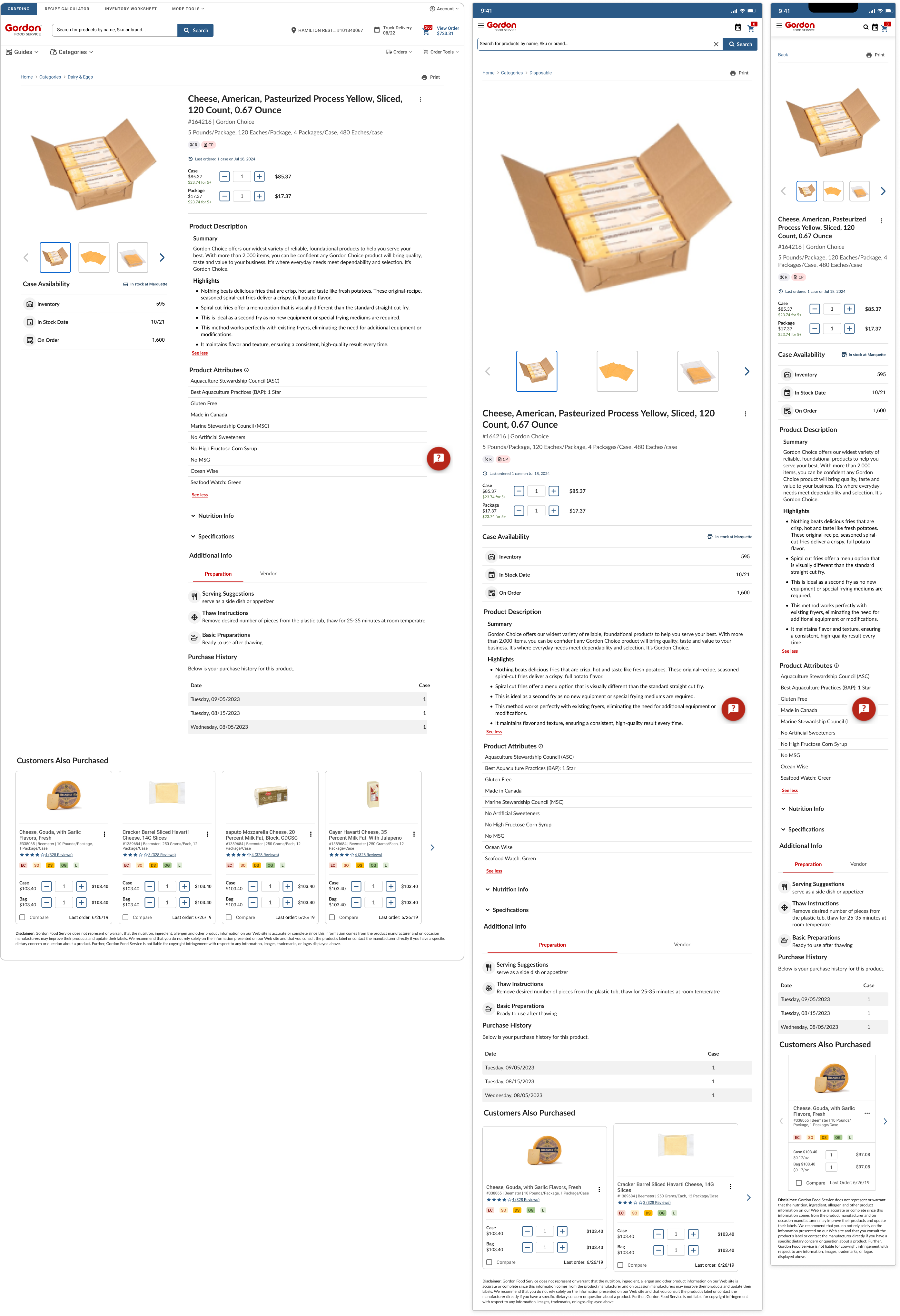
The PDP redesign delivered:
• Stronger content structure
• Larger, clearer product visuals
• A reworked “Add to Cart” section
• Design-system alignment for consistency and scalability
Reviewed validated e-commerce standards for PDP structure, content grouping, and conversion flows.
Studied B2B and B2C PDP formats for layout, hierarchy, and cart behavior.
Explored multiple approaches to the buy section and product information architecture.
Split-tested Iteration 3 against the existing PDP.
Persistent buy controls.
Feedback: Too intrusive, especially on mobile.
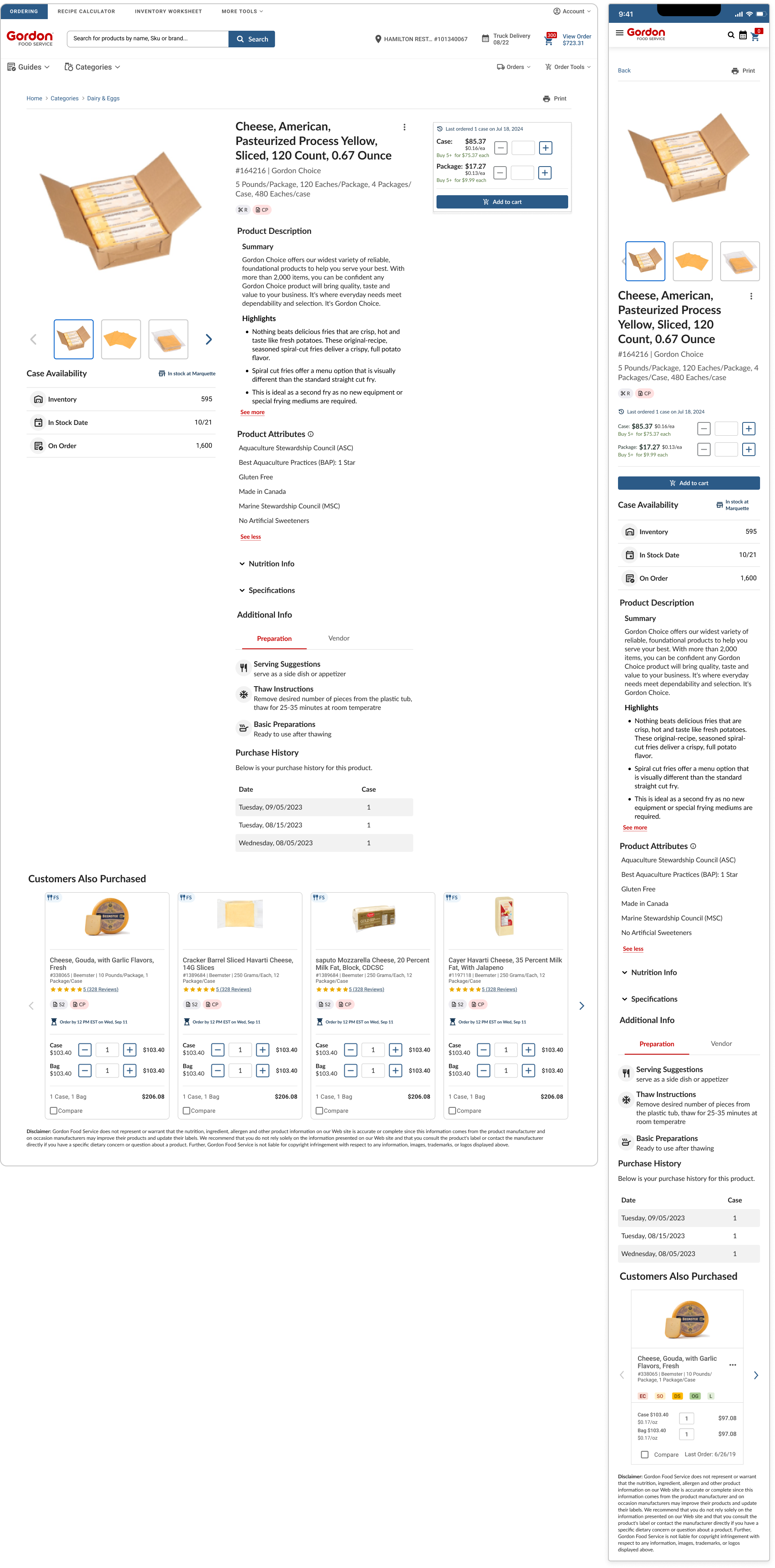
Improved structure but switching tabs added friction.
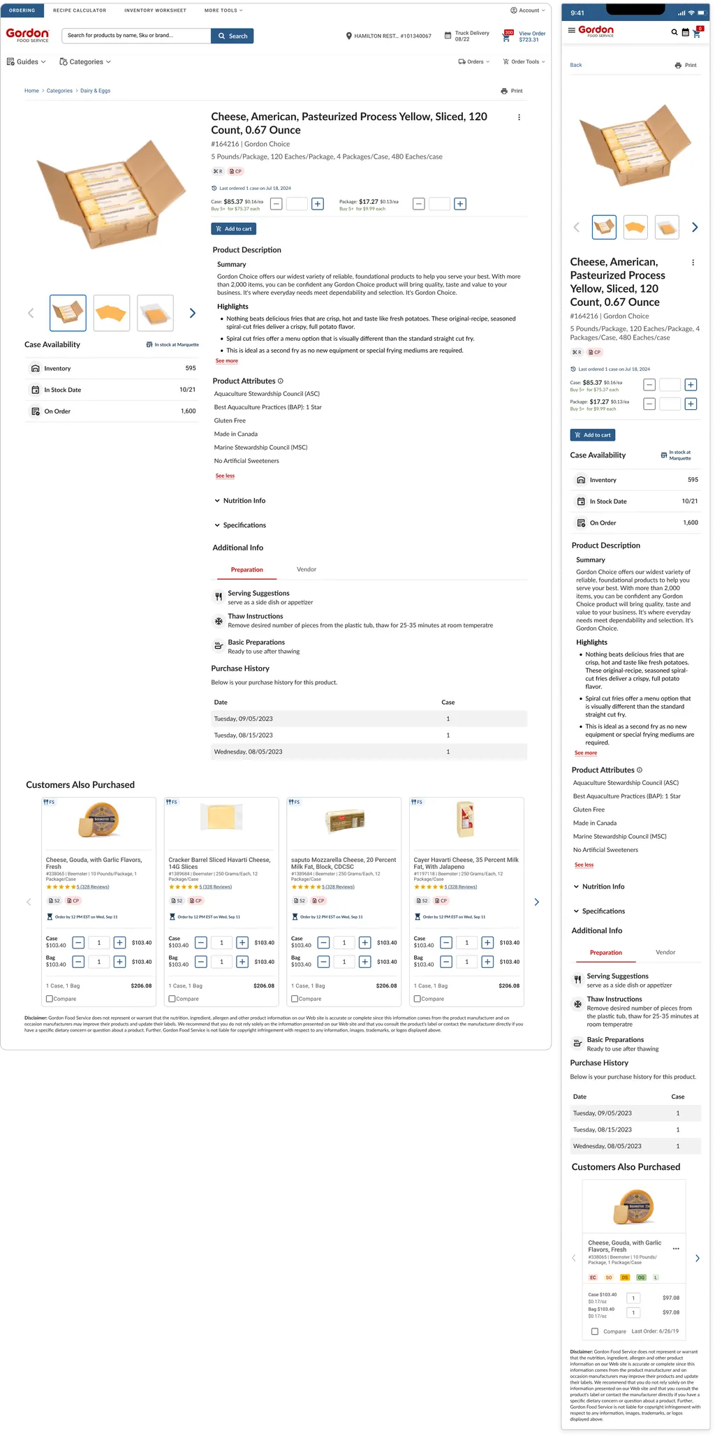
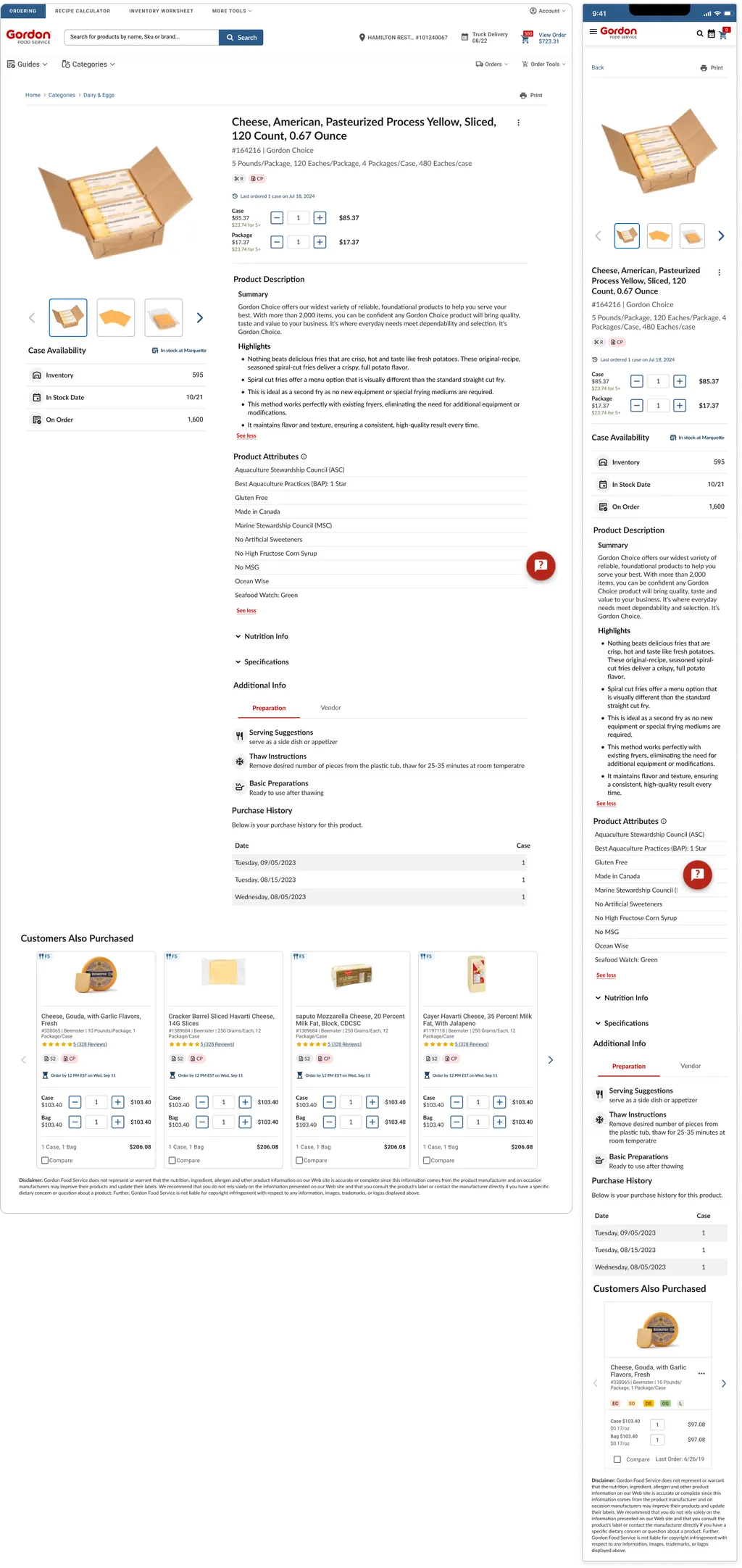
Tabs removed, clarity improved, friction reduced.
Winner because:
• Faster evaluation
• Higher engagement
• Fewer decision obstacles
Participants compared the old PDP vs the redesigned one.
• Faster scanning of product details
• Easier “Add to Cart” interactions
• Better content hierarchy understanding
• Stronger visual clarity
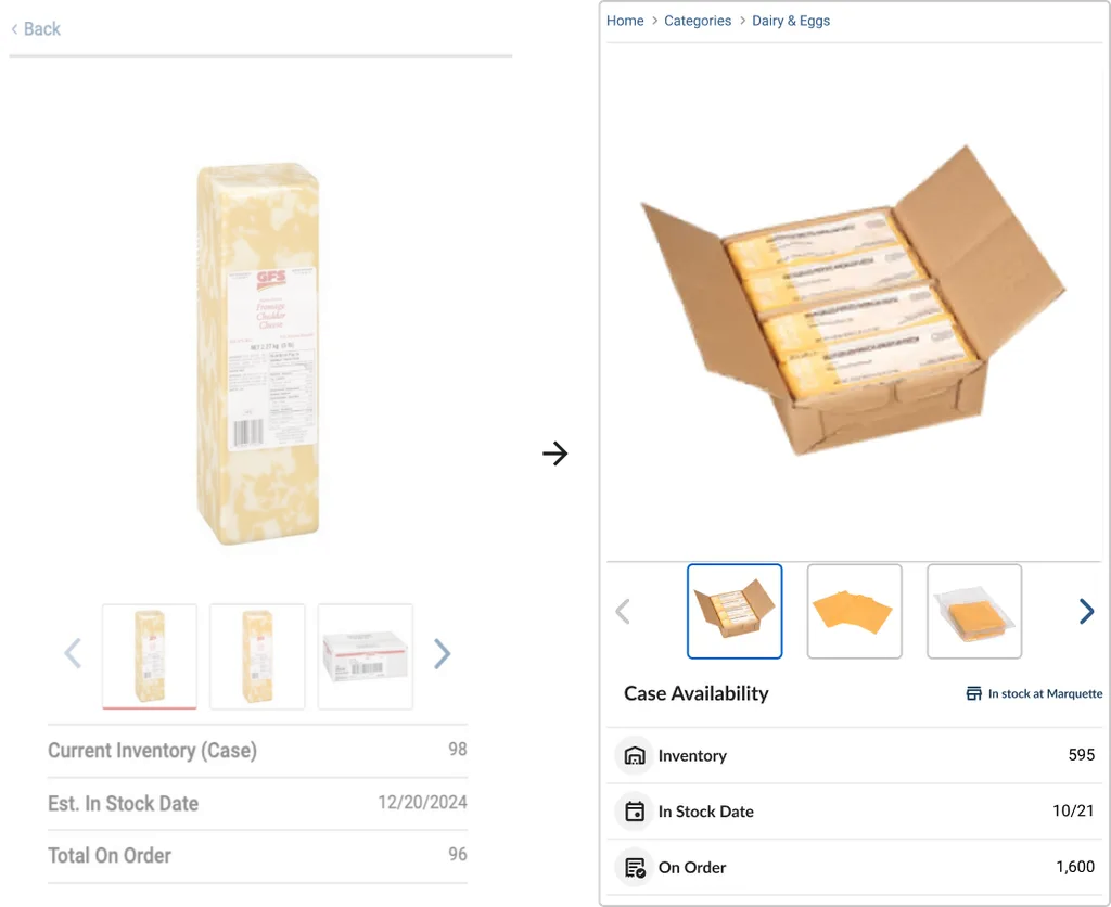
Larger images, clearer thumbnails, improved angles.
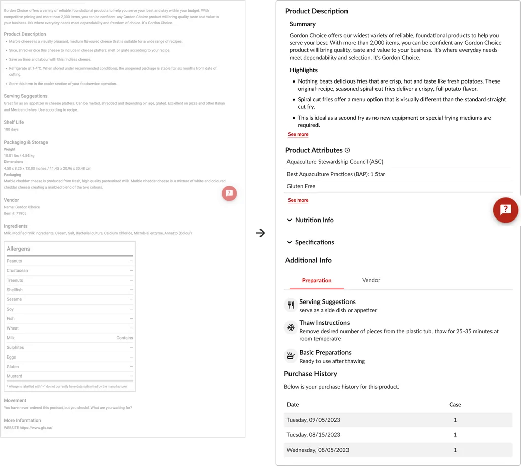
Structured, collapsible sections for highlights, attributes, and details.
Prioritized pricing, unit selection, and CTA visibility.
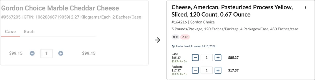
Improved responsive behavior and layout consistency across breakpoints.
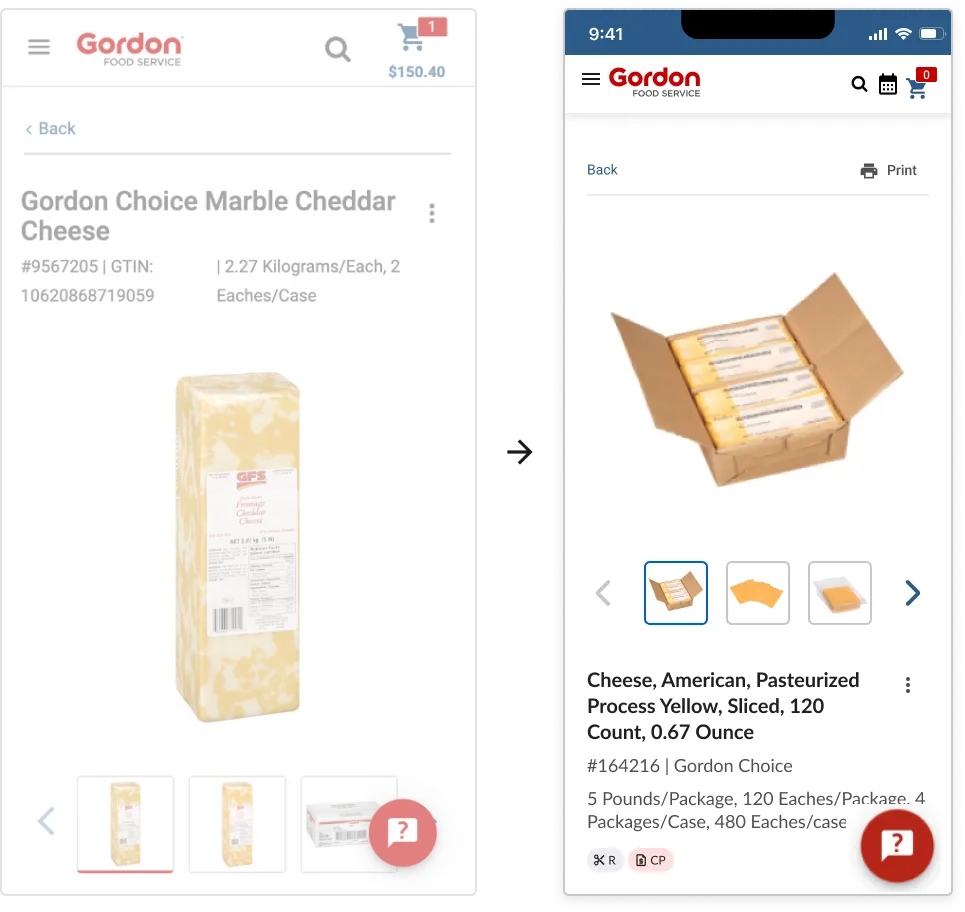
The redesign delivered measurable improvements:
↑ 12 %
↓ 10 % (faster decision-making)
↓ 11 %
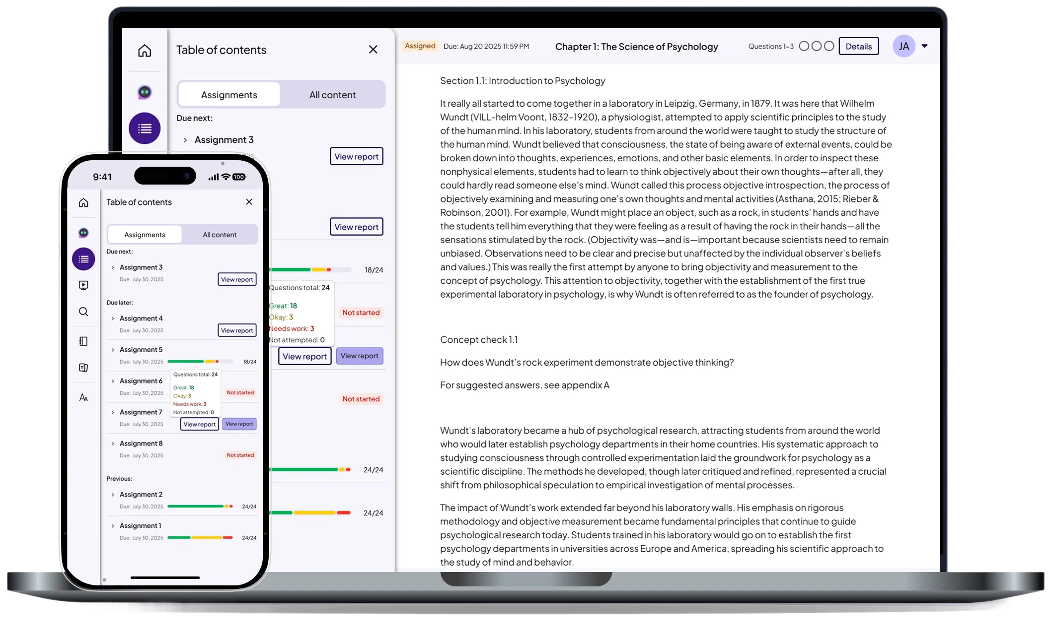
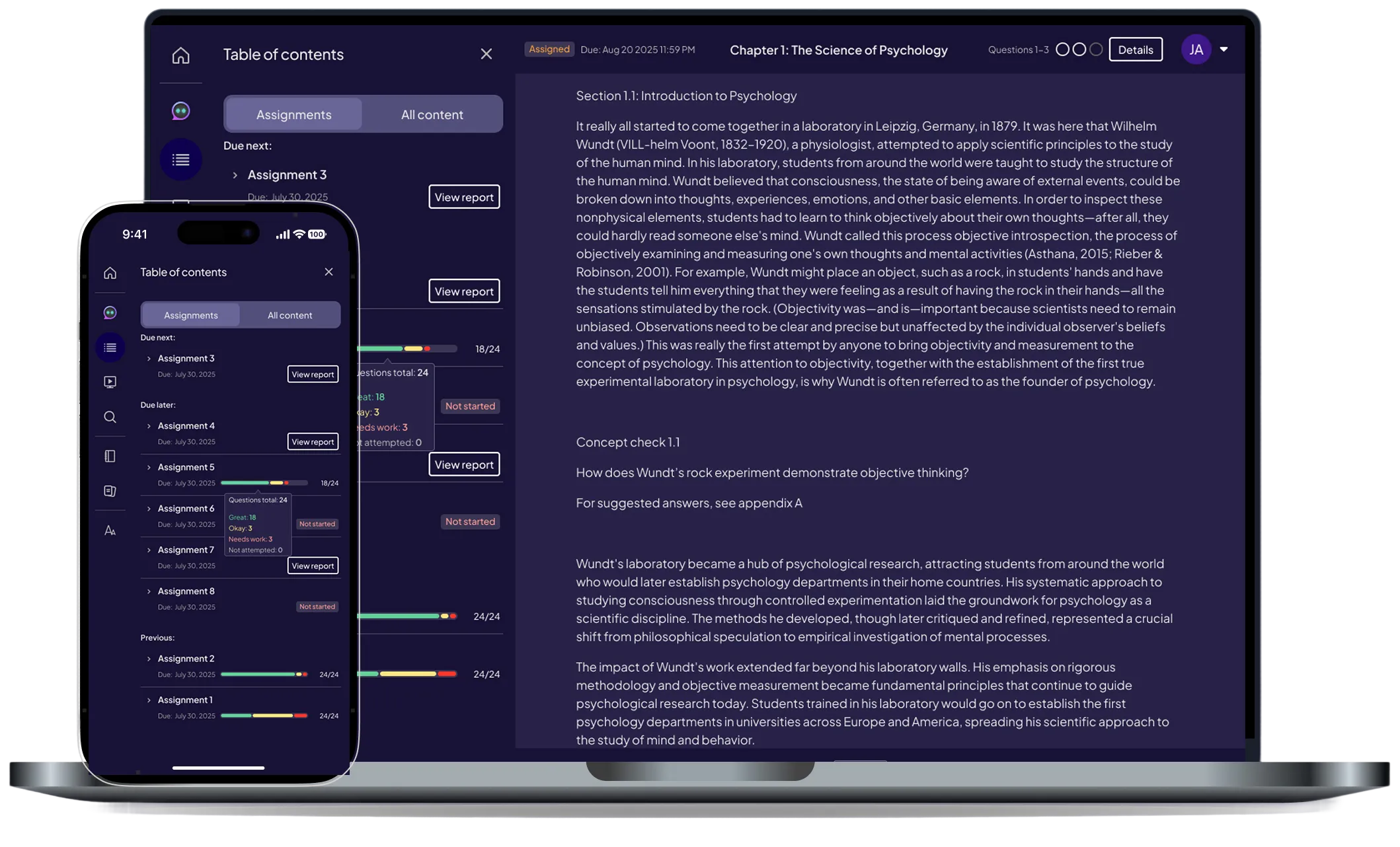
Pearson (EdTech)
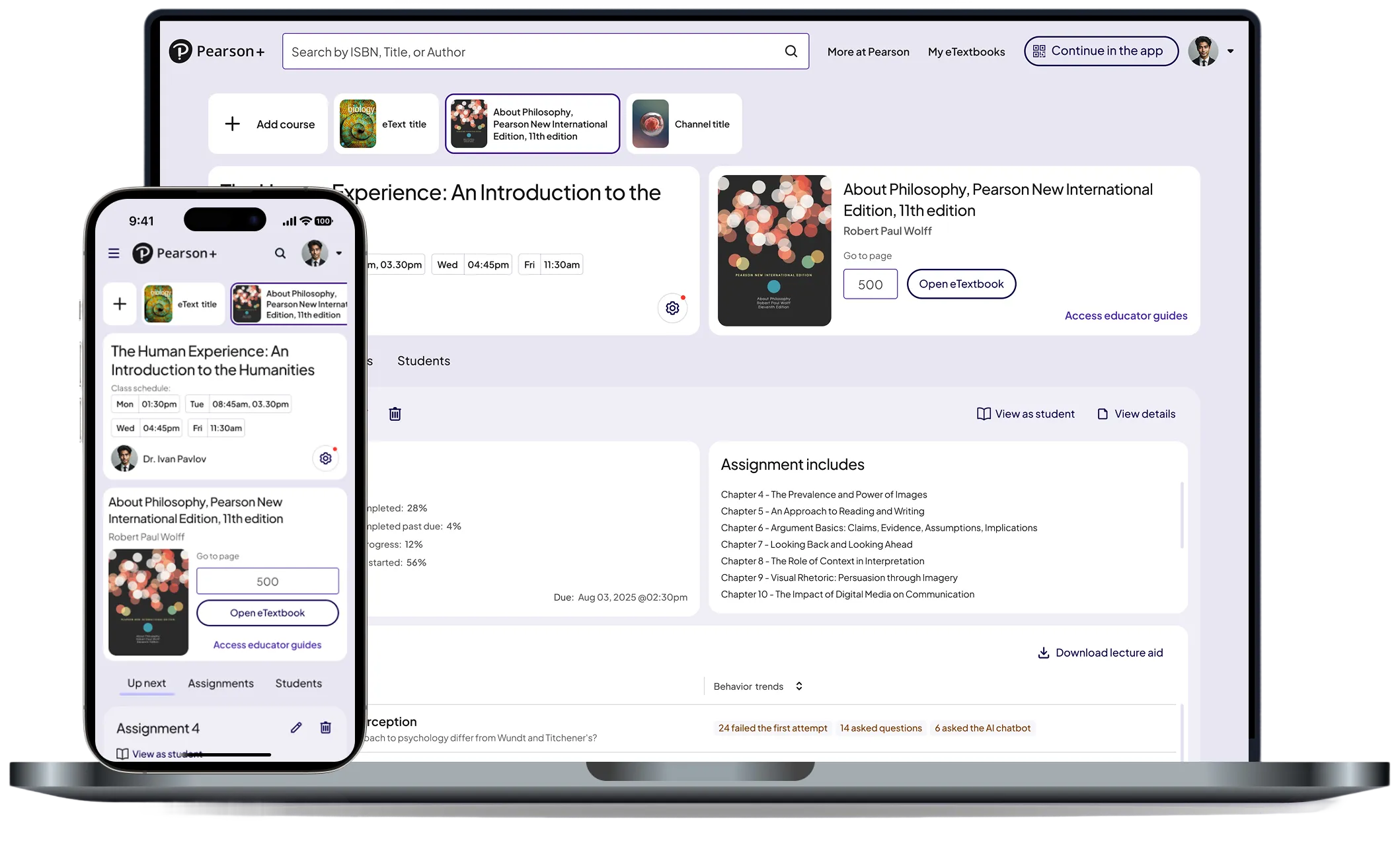
Turning raw performance data into clear, actionable insights across web and native.
Pearson (EdTech)
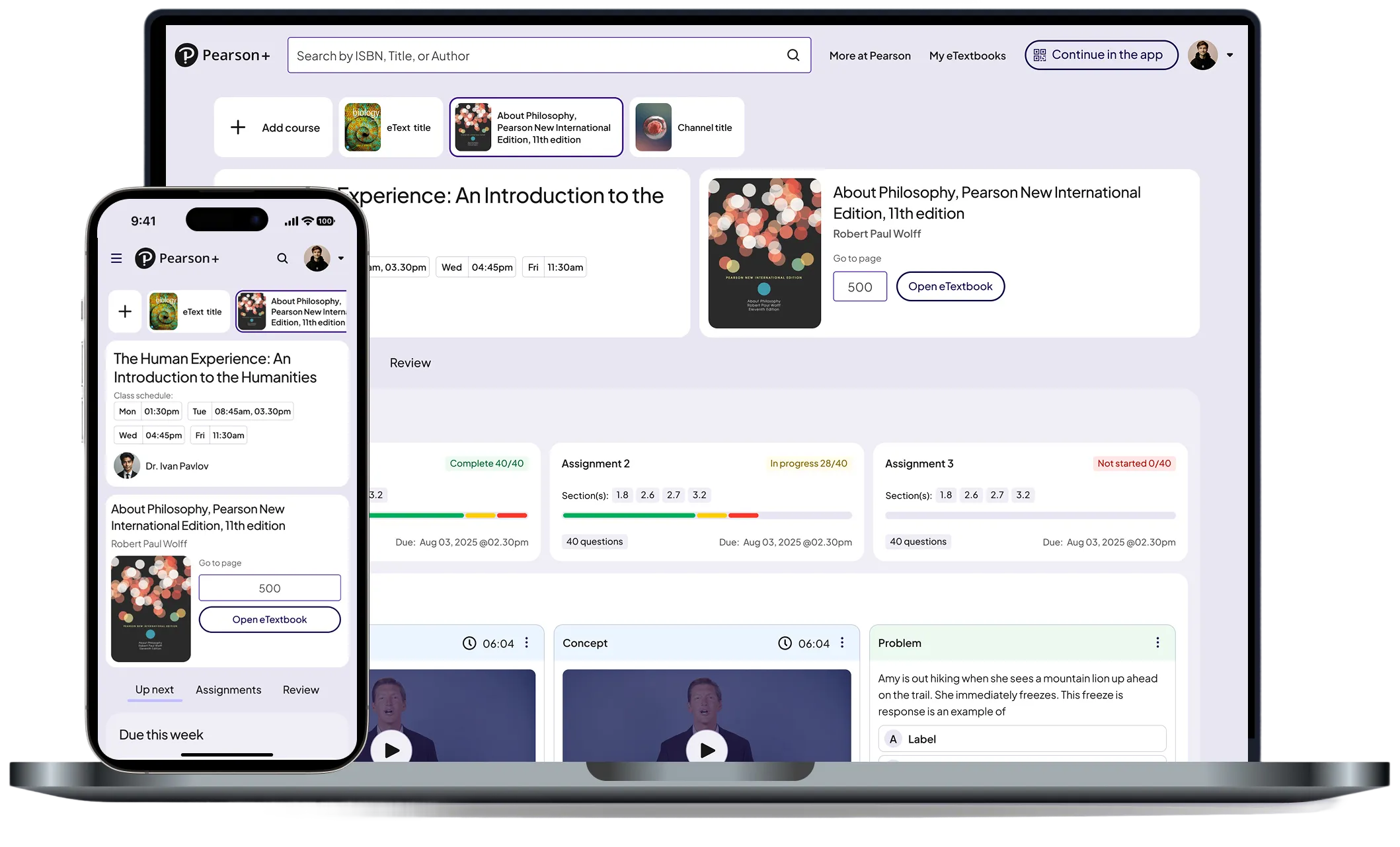
Improving navigation and content accessibility with a unified drawer system across web and mobile.
© 2026 Dandrew Merriweather | Designed + Built by Dandrew