
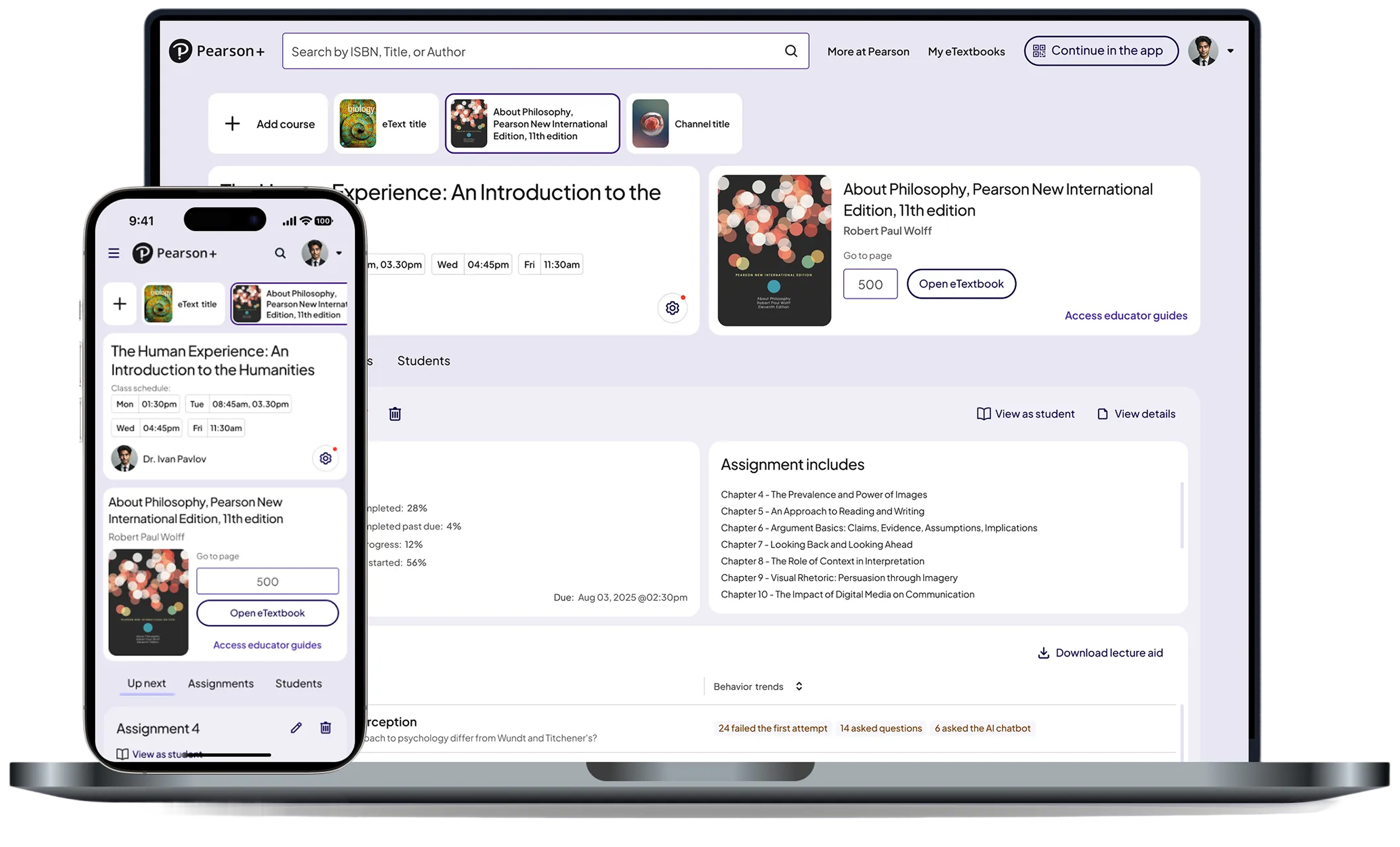

Pearson
Turning raw performance data into clear, actionable insights across web and native.
Role: Senior Product Designer
Timeline: 2025
Platform: Web + Native
Collaborators: PMs, Engineers, Research, Design Systems Team
Before this work, Pearson’s AeT platform had no centralized dashboard experience for students or educators. Students lacked clear daily priorities, while educators had limited visibility into engagement, assignment progress, and learning trends.
I led the design of Pearson’s first student and educator dashboards from zero to one, defining the IA, insight hierarchy, core workflows, and scalable design system patterns across web and native.
A quick view of class health
Early identification of at-risk students
Trends across topics and assignments
Clear drill-downs for deeper insight
A single place to understand what’s due
Clear prioritization (today, overdue, upcoming)
Consistent guidance across web and native
Support when falling behind
AeT had the data but lacked a unified experience to surface insights in a way that supported real teaching and learning workflows.
Partnering with research, I conducted interviews with 13 educators and additional student sessions to understand their mental models, workflows, and priorities.
Educator Insights (MoSCoW Prioritization)
1. Assignment-Level Histograms
Need score distribution, not averages.
“I want a histogram of completion, not just the average.”
2. Student & Topic Drill-Downs
Compare students, assignments, and topics.
“I want to compare students across assignments and topics.”
3. Behavior-Change Detection
Early visibility into drops in engagement or performance.
“I want to see changes in student behavior.”
1. Topic-level performance patterns
2. Class-section comparisons
1. National benchmarks
1. Raw time-on-platform metrics (too misleading)
Need score distribution, not averages.
“They’ll just log in for 3 minutes to look active.”
1. What’s due today
2. What’s overdue
3. What’s upcoming
4. Review
Before designing the final dashboard experiences, I mapped educator and student workflows to better understand how assignments, remediation, LMS integrations, and intervention behaviors connected across the broader platform ecosystem.
This systems mapping helped identify dependencies, reduce workflow complexity, and align dashboard experiences around actionable decision-making.
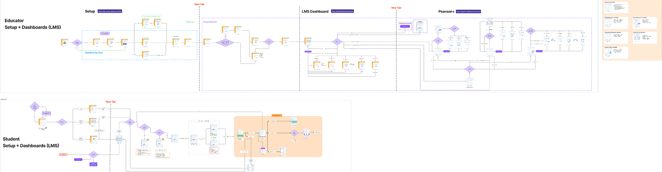
The educator experience focused on helping instructors quickly identify at-risk students, track assignment performance, and navigate intervention workflows more efficiently across the LMS and Pearson+ ecosystem.
The workflow mapping helped surface key decision points around performance visibility, assignment states, and student engagement behaviors.
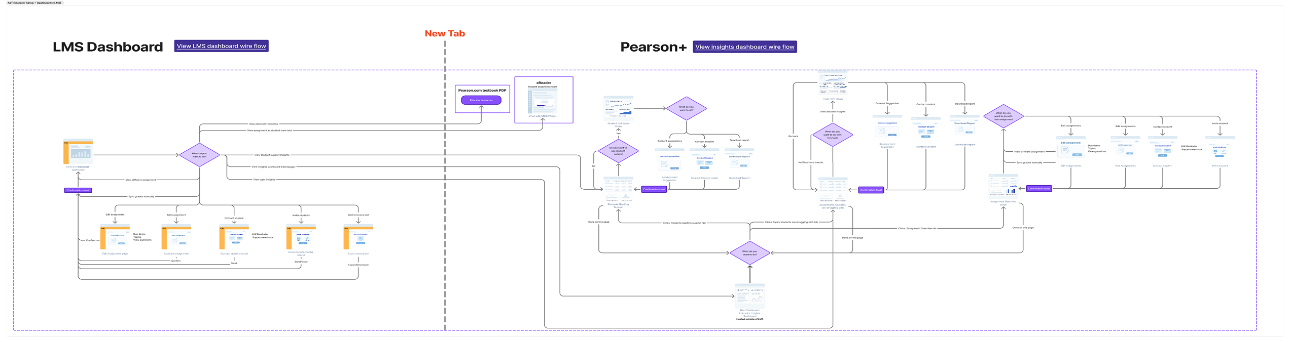
The student experience focused on reducing cognitive load by helping learners better navigate assignments, remediation paths, and progress tracking across multiple states and learning scenarios.
The workflow mapping clarified how students moved between dashboard experiences, assignments, and support resources while identifying opportunities to simplify navigation and prioritization.
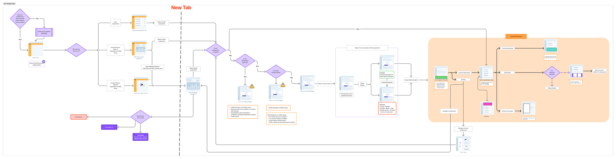
Workflow Files
Explore the full workflow mapping and systems architecture in FigJam. [Open FigJam ↗]
Every insight was designed to answer,What should I do next
Shared layouts, spacing, and navigation patterns ensured consistent behavior across platforms
Prioritized essential information first, with drill-downs available for deeper analysis
Educator Dashboard (Instructor Insights for AeT)
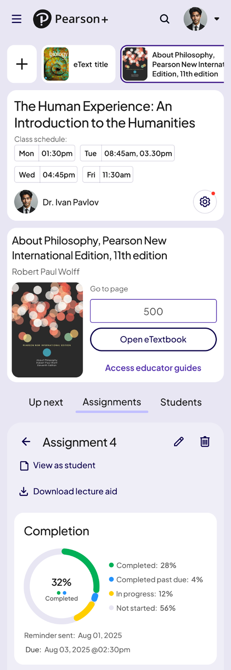
These screens show how the Educator Dashboard supported data-driven teaching across class, assignment, and student levels.
Gives instructors a clear snapshot of class health, students needing support, and topic-level challenges. This helped educators identify issues early and prioritize where to intervene.


A detailed breakdown of assignment performance, including score distributions, question-level trends, and completion rates. This enabled teachers to quickly understand where students were struggling.
.png)
A focused view of an individual student’s engagement, performance, and risk indicators. Educators used this screen to offer personalized support and track progress over time.
.png)
.png)
Automated alerts highlight meaningful shifts in engagement or performance. These notifications gave educators early visibility into drops in progress and allowed timely intervention.
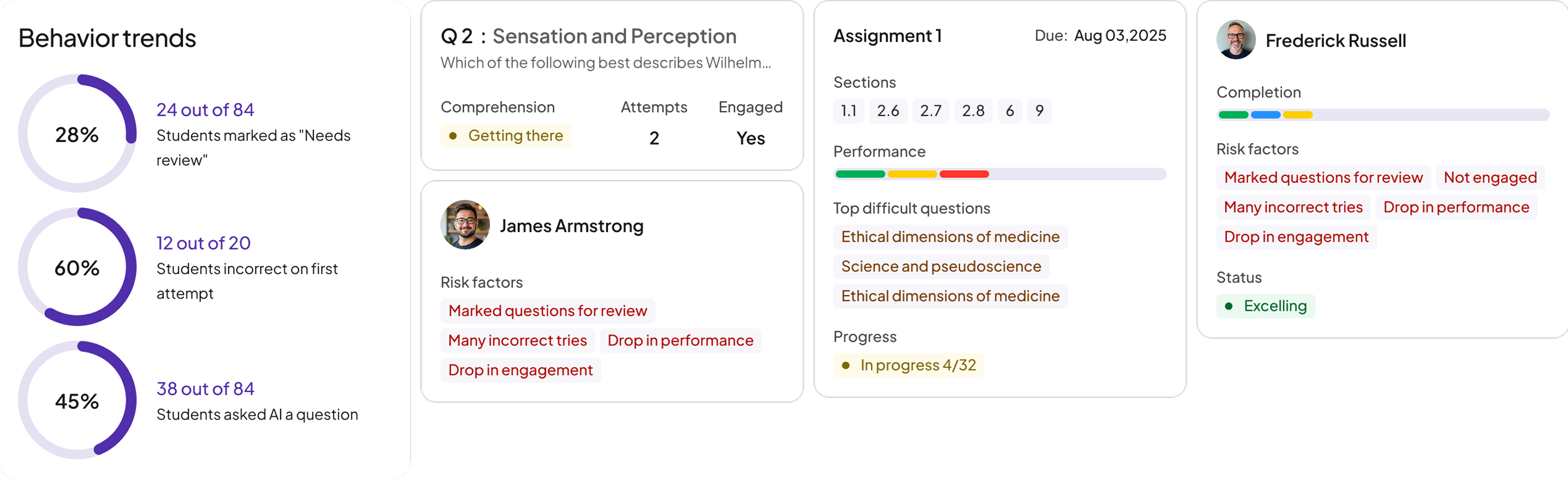
This became the central hub for understanding class performance within AeT.
Student Dashboard (AeT)
Designed to reduce confusion and help students focus on what matters most.
A quick view of upcoming tasks and actions so students always know their next step.

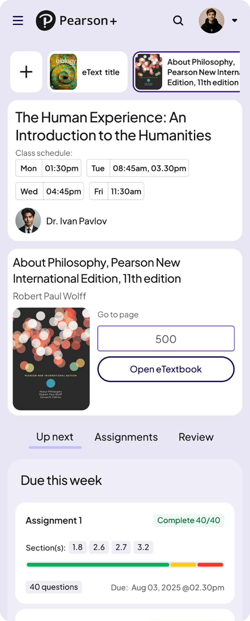
A structured breakdown of due, overdue, and completed work to help students stay organized.
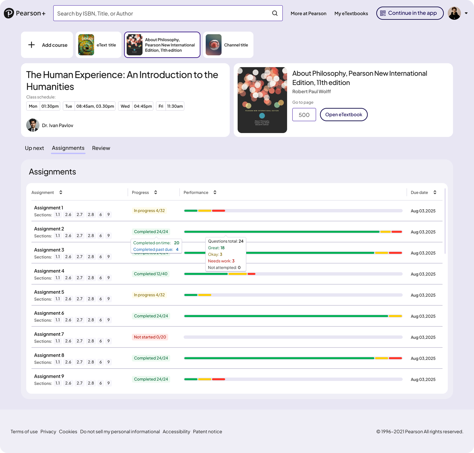
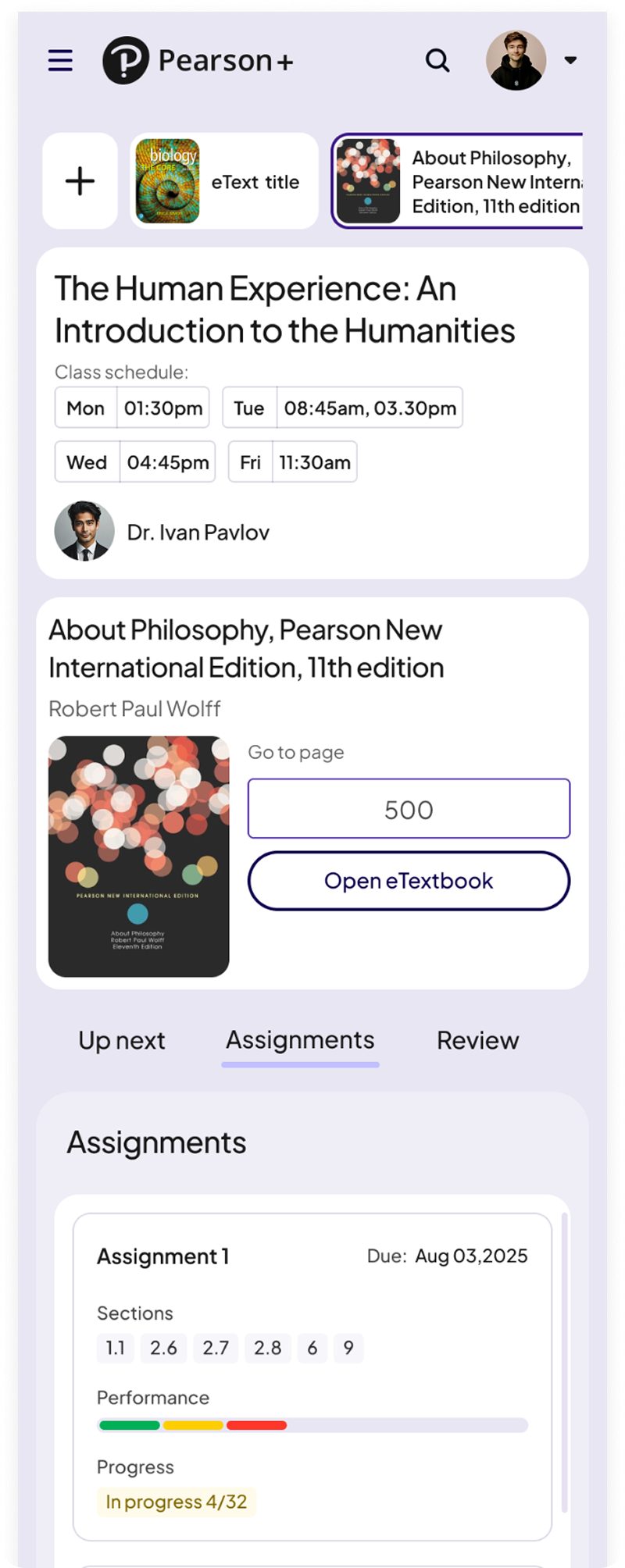
A dedicated space for reinforcing concepts, reviewing missed questions, and strengthening understanding.


A dedicated space for practicing topic-level multiple-choice questions, reviewing missed answers, and strengthening understanding.
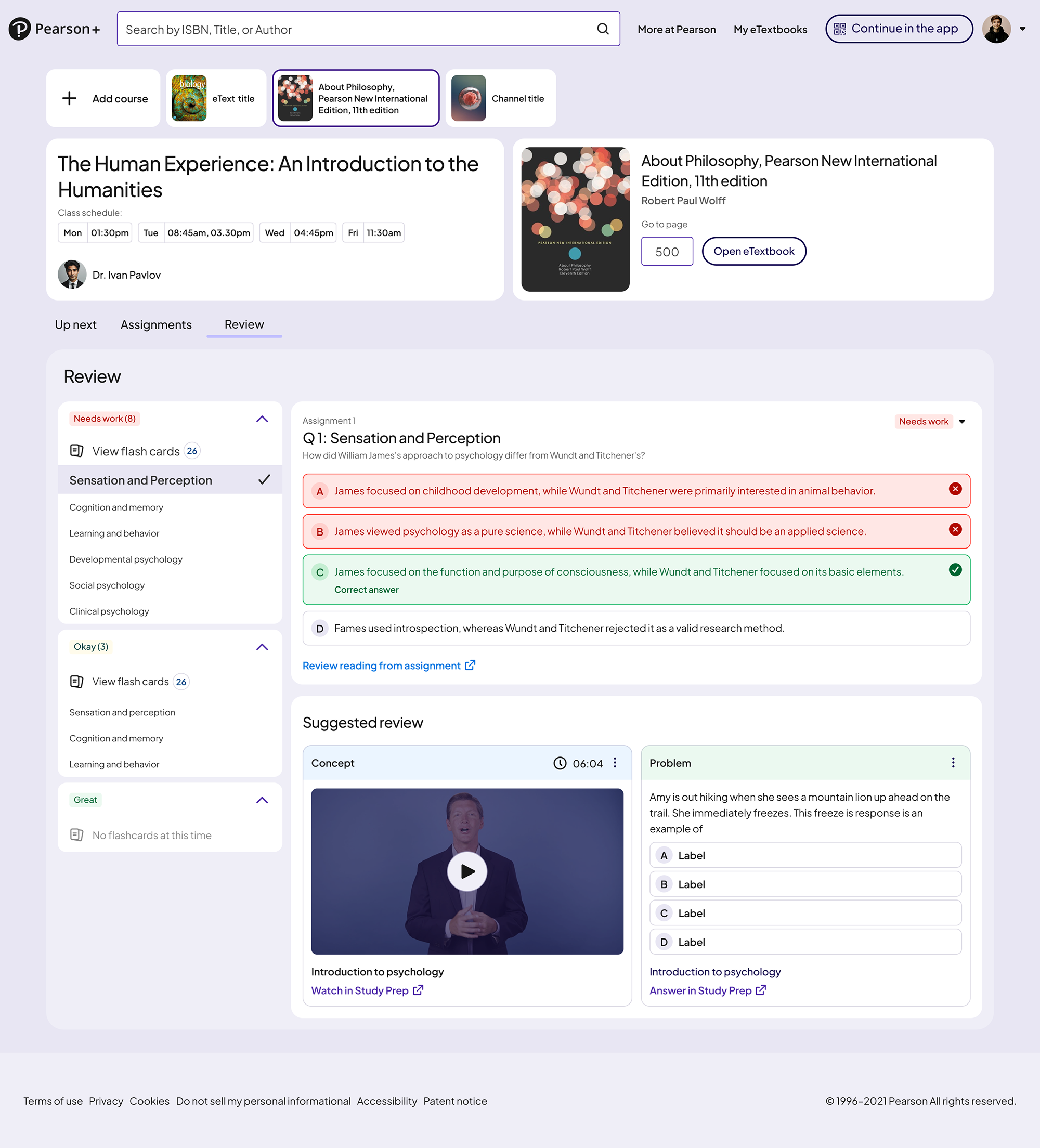
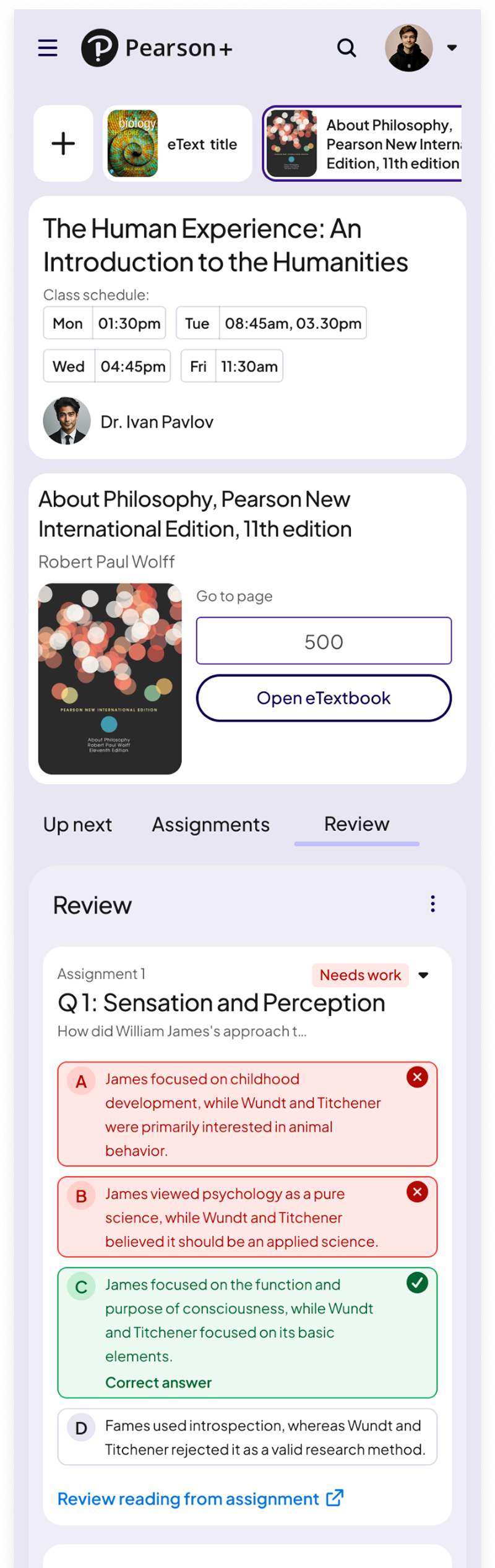
Students quickly understood priorities and next steps.
Because AeT had no dashboards before this project, many required DS components didn’t exist.
These became foundational elements in the Pearson Design System and supported later theme work, including Sepia Mode
A scalable pattern for surfacing key insights across web and native, providing a consistent summary layout for instructors and students.
.png)
Unified histogram and trend components that standardize how performance data is visualized across AeT and reduce inconsistency across teams.
.png)
A clear system for highlighting at-risk students and urgent tasks using consistent color, hierarchy, and status tokens.
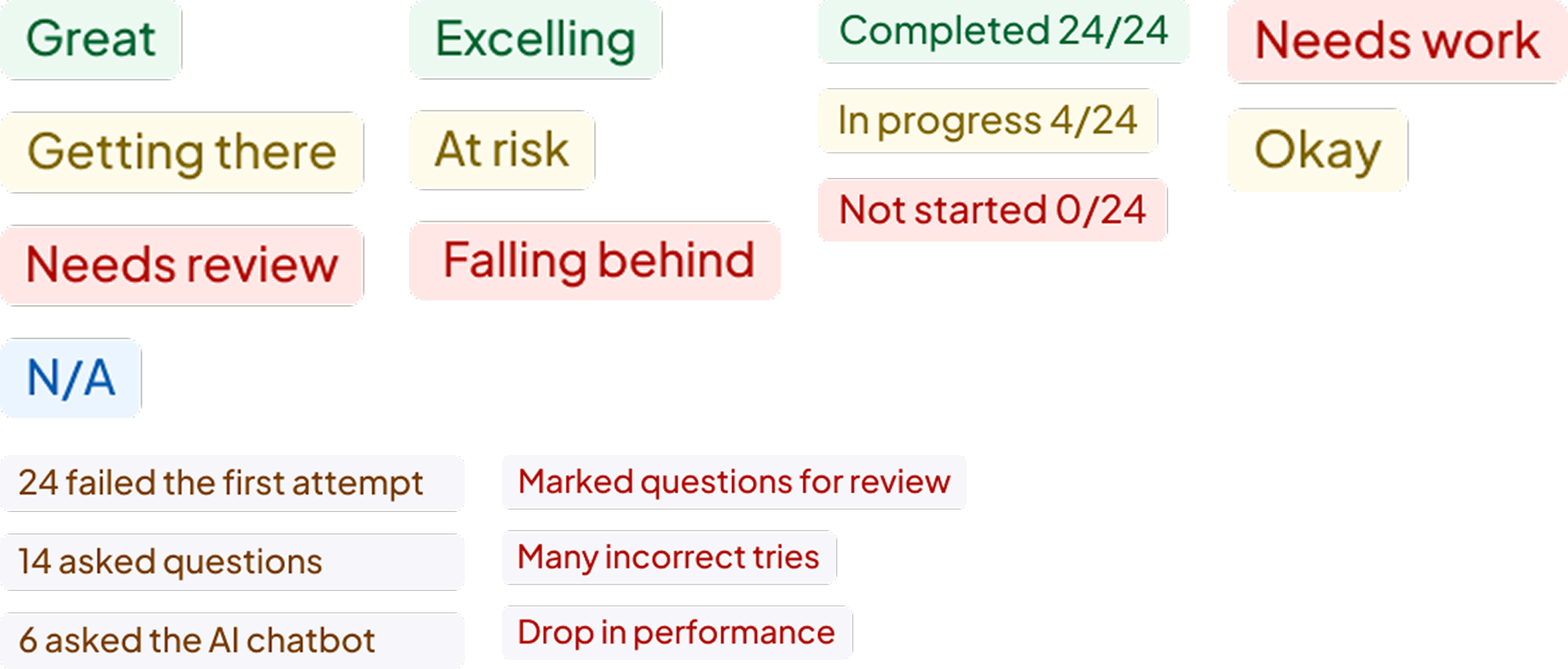
This work established AeT’s first scalable analytics foundation, improving visibility, decision making, and consistency across web and native for both students and educators
Enabled faster identification of at risk students to support earlier intervention
Improved visibility into assignment performance and topic trends
Established consistent, predictable drill-down patterns for deeper analysis
Introduced reusable components adopted across learning teams
Created clear daily priorities that guide learning and next steps
Increased engagement with remediation and follow-up actions
Reduced friction across web and native experiences
Established new insight and chart components for analytics experiences
Strengthened cross-platform alignment across web and native
Built scalable patterns to support future dashboard and insight features
Enabled component reuse across multiple product teams
The next phase would focus on testing whether earlier engagement signals, like reading drop off or missed assignments, should surface in the class overview before a student is already at risk. The bigger question was whether educators would act on predictive indicators early, or rely more on confirmation based data throughout the semester.
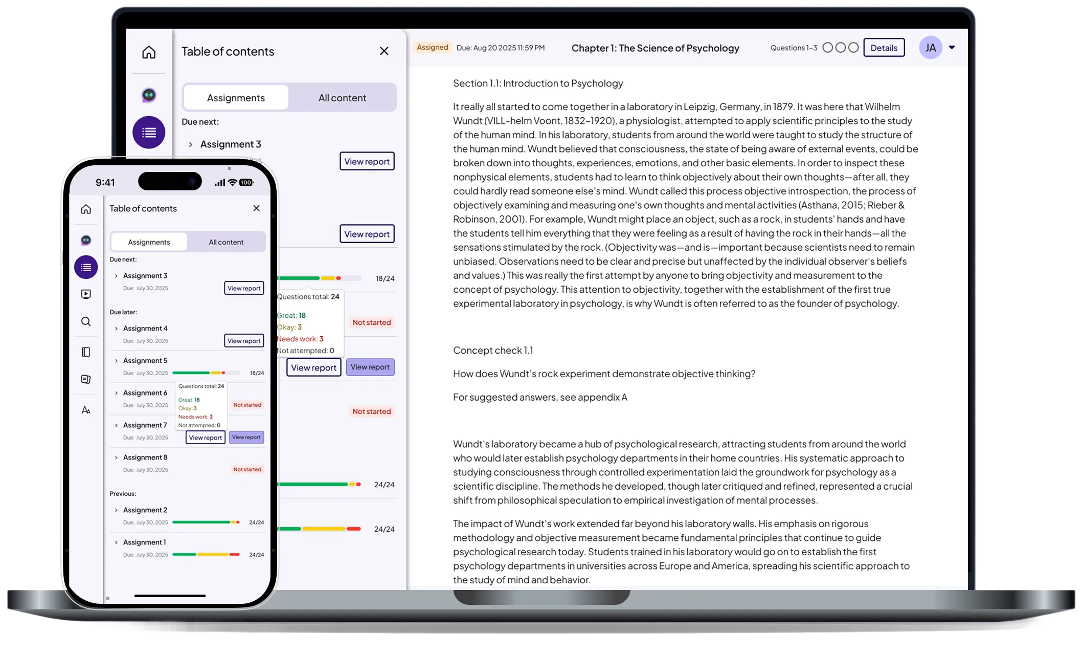
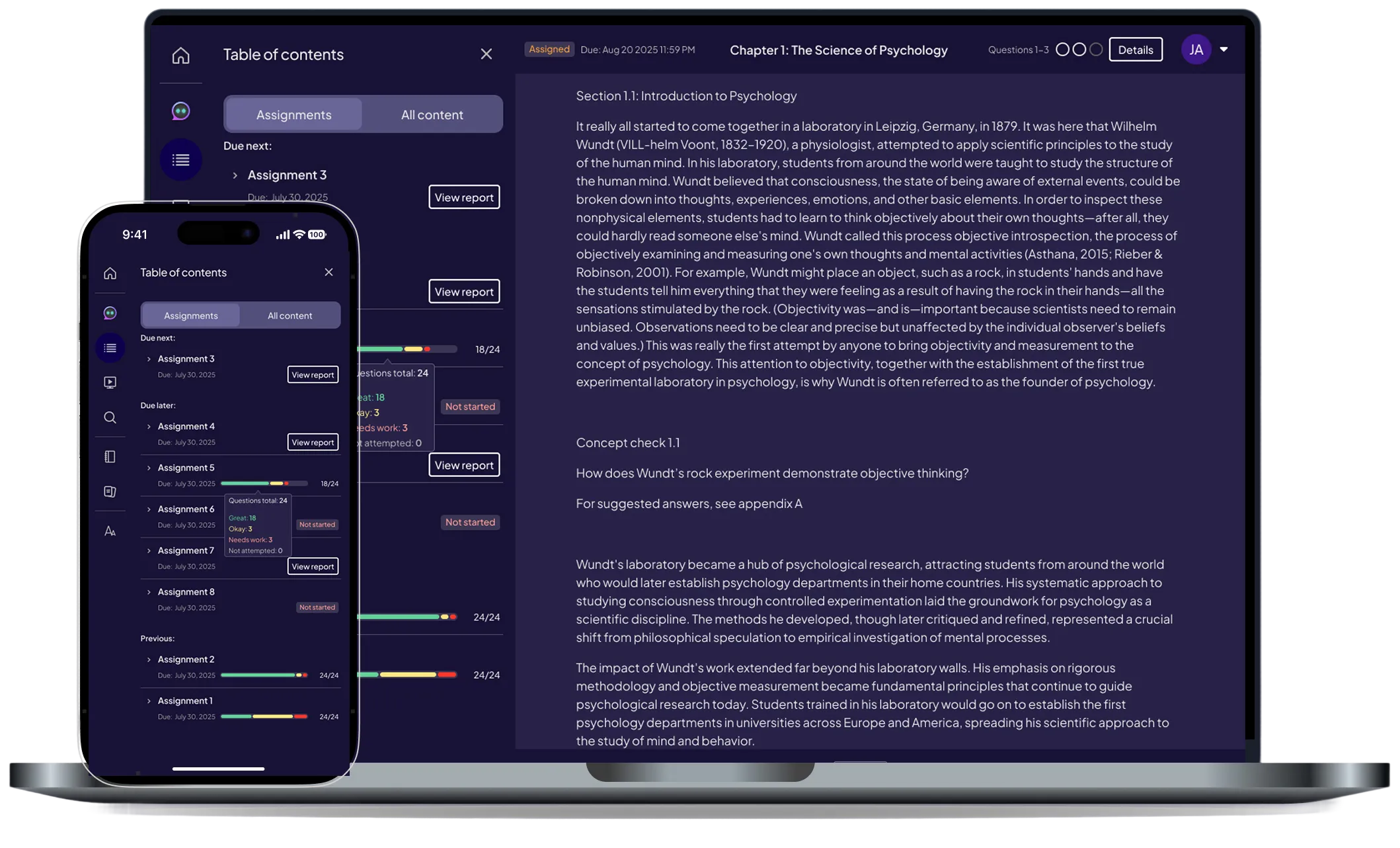
Pearson (EdTech)
Improving navigation and content accessibility with a unified drawer system across web and mobile.
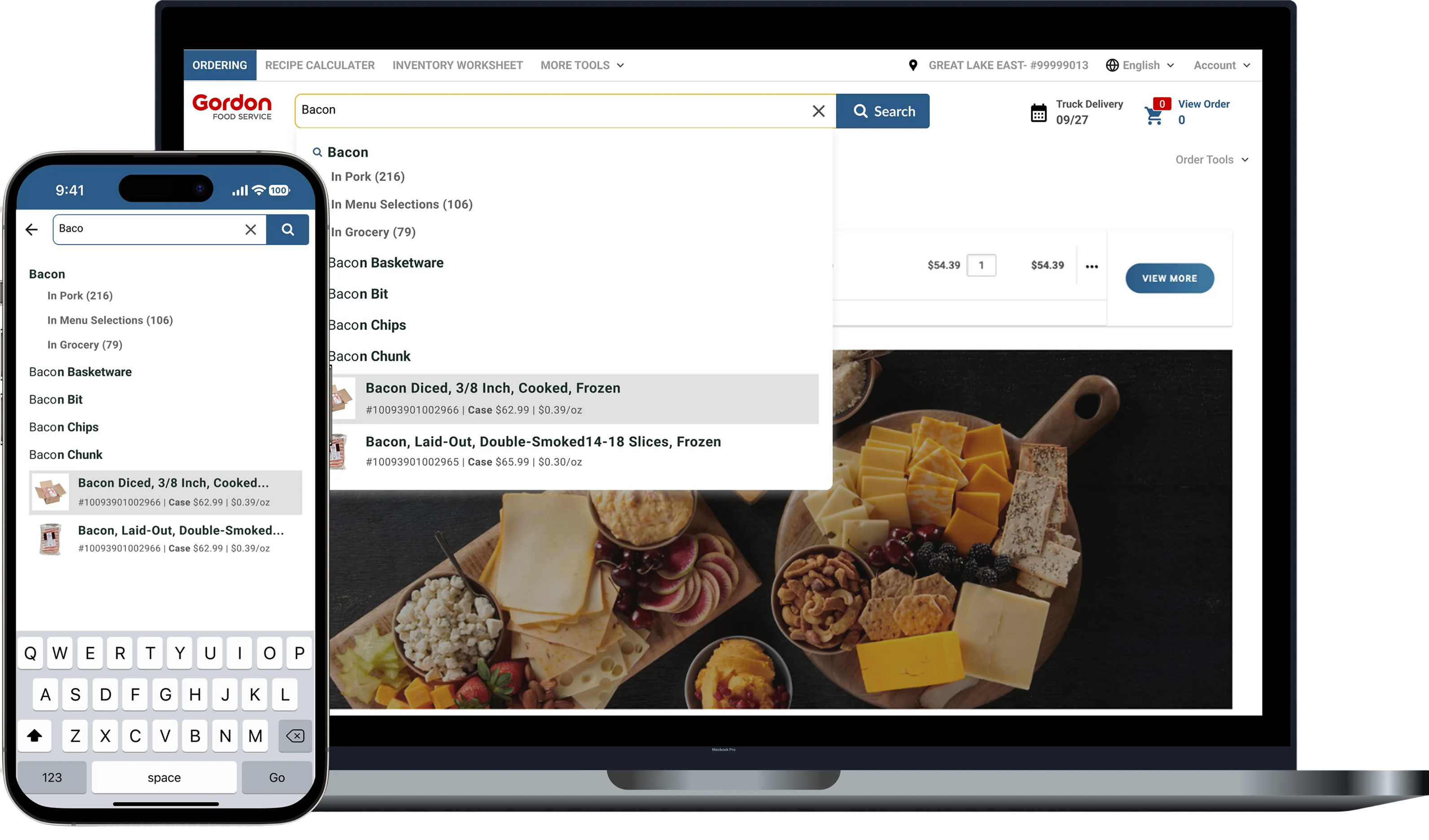
Gordan Food service (B2B eCommerce)
Improving product discovery and ordering efficiency through smarter autocomplete, filtering, and scalable search patterns.
© 2026 Dandrew Merriweather | Designed + Built by Dandrew